Who's Actually Winning: The Deepest Racing Stats in Australia & NZ
16 June 2026·8 min read
Today we're switching the lights on at HoofMetrics. After a long run of building, testing and quietly settling every selection against real results, we're ready to open the doors to a racing-analysis platform built on two ideas that, frankly, are rarer in this game than they should be: genuine analytical depth, and complete honesty about how we go.
There is no shortage of places that will tell you which horse to back. There are far fewer that will show you the depth of data behind a view, and almost none that will then publish every result — winners and losers — staked the same way, settled the same way, with the scoreboard left on for anyone to read. That's the gap we set out to fill.
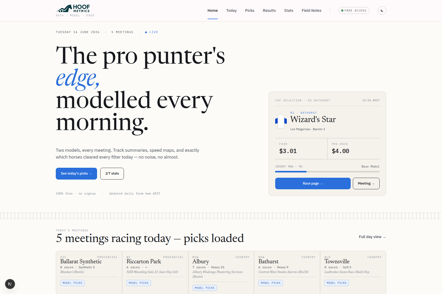 The HoofMetrics home page — today's top selection, fair-vs-market price, and every meeting racing, every morning.
Most punters lose, and most of them lose for the same reason: they're working with a fraction of the picture and being marketed a polished version of someone else's record. Tipsters quietly retire their bad months. "Strike rates" get quoted without ever mentioning the price you'd have got. Form guides hand you raw numbers — a jockey's wins, a trainer's runners — without the one thing that actually matters, which is whether those numbers are beating the market or just following it.
We come at racing from a data-first angle. Behind HoofMetrics sits a modelling pipeline that ingests Australian and New Zealand TAB racing, race by race, and turns it into something a person can actually use: a clear selection, a picture of how the race will be run, and the season-long context to judge whether any of it is worth your money. We're not going to walk you through the internals of the model — that's our edge, and it stays under the bonnet. But everything the model produces, and everything we know about the horses, the people and the tracks, we're putting in front of you in as much depth as we can render.
Start with the part most services would rather you didn't see: our results ledger.
Every published selection is settled in the open. We stake a flat $1 to win at the starting price on each qualifying bet, in race-time order, and we plot the running profit and loss as a cumulative curve you can scroll through day by day. No retrospective tinkering, no "we'd have had that one if". When a selection doesn't qualify on the day's discipline — including a hard daily stop-loss that caps how much a bad day can cost — it simply doesn't count, and you can see exactly why.
 Every selection is logged and settled — the good days and the bad ones.
Settling at the starting price matters more than it sounds. It's the honest benchmark: the price anyone could actually have taken at the jump, with no assumption that you snapped up some fleeting early quote. A track record built on SP is a track record you can trust, because it's the one you could have lived.
This is the number we want to be judged on. Not a highlight reel — the whole curve.
Open the Stats Hub and you'll find season-to-date numbers on jockeys, trainers, jockey-and-trainer combinations, and sires across the full Australian and New Zealand program. Wins, places, strike rate, place percentage — the usual furniture, all sortable with a click and searchable as you type.
One column does a lot of the heavy lifting: A/E, or actual-versus-expected. It's one of the most useful numbers in racing — and while the better form services do compute it, plenty of places bury it or leave it off. We put it on every leaderboard.
A/E compares how often a runner actually wins against how often the market expected it to. An A/E of 1.00 means a jockey or trainer is performing exactly in line with their prices — fair value, no edge either way. Above 1.00 means they're outperforming what punters paid for; below means they're being over-bet. It's the difference between "this trainer wins a lot" (often because they run short-priced favourites) and "this trainer wins more than the price suggested they should" — and only the second one puts money in your pocket. We compute it from real starting prices over real runners, not a sample or an estimate.
Alongside A/E sits a level-stakes ROI for every name, and a little trend sparkline showing how each performer's win rate has moved month by month through the season. You can flip the whole board between Australia, New Zealand, and combined in an instant.
None of these numbers are unique to us on their own. What is unique is how far you can slice them — by state, track, condition, runner age, race distance and more — and have every figure recompute exactly for that precise pocket of racing. That depth of filtering is the thing you genuinely won't find anywhere else, and it comes into its own with sires.
The sire section is where the depth really opens up. For every sire with runners this season we hold a full cross-tab you can slice live:
Every one of those filters combines with the others and re-derives strike rate, A/E, ROI, prize and stakes record on the fly. It's the kind of breakdown a serious breeding or staying analyst would normally build by hand — and here it's three clicks.
For the major metropolitan tracks we also publish heatmaps: a grid of every leading jockey and trainer against each big-city venue, each cell colour-graded by performance and stacked with starts, wins, strike rate, A/E and ROI. It turns "so-and-so goes well at Randwick" from a hunch into something you can read off a wall. Course specialists light up immediately; so do the names quietly going off the boil at a track that supposedly suits them.
Picking a horse is only half of it — how the race is run decides as much as who's in it. Every race we cover gets a speed map: a visual of where each runner is likely to sit, sorted into run-style bands from the natural leaders back to the swoopers. One glance tells you whether the race is set up for an on-pace grind or a hot tempo that'll fall in for something running on.
Around that sits the full race guide — our model's leading selections for the race with the value clearly flagged, written commentary on the likely pace and shape, and a set of stats tabs going deeper still: distance-by-distance actual-versus-expected tables, the jockey and trainer angles that matter for this race, and the relevant historical context for the contest. Click into a runner and the page expands into the detail behind it rather than making you go hunting elsewhere.
We back that with evergreen track profiles — a permanent, accumulating picture of each venue, its biases and the angles that have held up there over time. Tracks don't change every week, so this is knowledge that compounds.
Not everything belongs in a table. Field Notes — the section you're reading now — is where we'll write longer-form: explainers on how to read a speed map or what A/E is really telling you, notes on a track or a carnival, and the occasional honest post-mortem when the model and the result part ways. The data is the spine of HoofMetrics; this is where we talk about it like humans.
Here's the part we're happy to keep simple: all of it is open at launch. The selections, the settled ledger, the full Stats Hub, the speed maps, the track profiles, the Field Notes — no paywall, no trial countdown, no "premium tier" holding back the good stuff. We'd rather you spent a few weeks deciding whether the analysis is genuinely worth your time, with the scoreboard in plain sight, than ask you to take any of it on faith.
A word we mean sincerely: this is analysis, not a guarantee, and nothing here is a promise of profit. Racing is risk, the house edge is real, and a model having an edge over the long run does not stop any single day, week or month from going badly. Bet within your means, treat it as entertainment, and if it ever stops feeling that way, step away — the responsible-gambling resources are one click from every page.
The fastest way to understand HoofMetrics is to poke around it. Pull up today's selections, then go straight to the results ledger and judge them against the record. Open the Stats Hub, sort the trainers by A/E, and see who's actually beating the market this season. Browse today's racing and read the speed map on a race you're interested in tonight.
We've built the platform we always wanted as punters: deep where it counts, and honest where it matters most. Welcome to HoofMetrics — the workings are all yours.